先日、WordPressテーマSTINGER3の子テーマを使ってブログデザインを変更しました。でも、その時は、PCブラウザーとスマートフォンのブラウザーで見た時のヘッダーデザインを統一することができませんでした。
そこで、スマートフォン用スタイルシートsmart.cssの内容を再確認して一部手直ししてみました。その結果、なんとかPCブラウザーで見た時と同じヘッダーのデザインに変更できました。初めのうちは、PCブラウザーでのデザインを昨日のスマートフォンに合わせてしまおうかと考えていたので、うまく変更ができて喜んでいます。
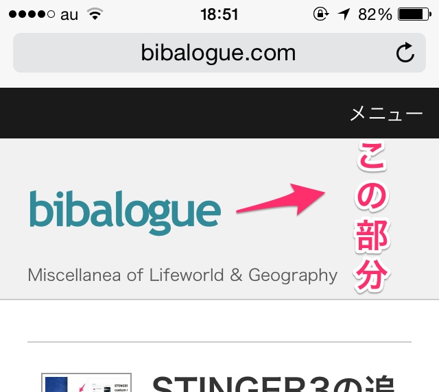
iPhoneでブログを見ると、次のようになります。昨日のものとヘッダー部分の配色が異なり、PCブラザーと同じ配色になっています。
smart.cssで変更した箇所
「基本のhタグ」部分
下記の9行目と14行目のColor指定を変更しました。
[css]
/*—————————–
基本のhタグ
——————————*/
/*ヘッダータイトル*/
#container #header #header-in #h-l h1 {
font-size: 12px;
color: #555555;
font-weight: normal;
line-height:1.2;
}
#header #header-in #h-l h1 a {
color: #555555;
text-decoration: none;
}
[/css]
「コンテンツ」の部分
下記の41行目と59行目と67行目のColor指定を変更しました。
[css]
/*—————————–
コンテンツ
——————————-*/
input {
height: auto;
max-width: 100%;
width: auto;
font-size: 14px;
}
submit {
padding: 10px;
width: 30%;
}
textarea {
height: auto;
max-width: 70%;
width: auto;
}
.post ul li {
font-size: 15px;
line-height: 28px;
}
.post ul {
list-style-type: disc;
padding-top: 20px;
padding-right: 20px;
padding-bottom: 20px;
padding-left: 20px;
}
.post .blog_info.contentsbox .clearfix {
list-style-type: none;
}
.sumbun .entry-title a:hover {
color: #C00;
}
#gazou-in {
padding-top: 0px;
}
#h-l .descr {
color: #555555;
font-size: 12px;
font-weight: normal;
padding-left: 0px;
margin: 0px;
padding-bottom: 10px;
line-height: 1.2;
}
.postdatemo {
margin: 0px;
padding: 0px;
}
.blog_info.contentsbox .clearfix {
margin: 0px;
padding: 0px;
}
#container #header #header-in #h-l .sitename a {
color: #318a97;
font-family: trebuchet ms;
font-size: 35px;
font-weight: bold;
line-height: 1.8;
text-decoration: none;
}
body {
background-color: #f1f1f1;
}
[/css]